Basic Accessibility Notes for Web Developers
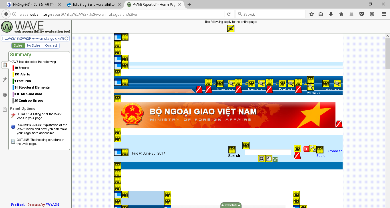
Making your website or any kinds of products/services accessible to everybody is the win-win solution, not only benefits the people with disabilities but also gets your products or services to more customers and strengthens your brand. It doesn’t cost you much compared to what you are going to get if you keep the accessibility in mind from the beginning stage. Before writing this article, I had a quick check on about 20 Vietnamese government websites and find out one sad thing that all these websites are not accessible at all. I would like to give web developers a quick tour on key points that you should please pay attention as designing, developing and creating the content.

Page Structure
Web developers should understand and differentiate clearly the function of HTML, CSS and JavaScript. HTML is used to build the page structure, while CSS is used to design the appearance/add visual effects and JavaScript is to add more dynamic functions for the website.
- Trying to make your web page is arranged in such a logical way by using heading tags (h1, h2, h3). Headings should be used to divide hierarchical level. For instance, using heading 1 for your page title, heading 2 for page subtitles and vice versa. Note, you should not use too many headings to divide into too many levels. This would cause visitors get confused. And I see one mistake that many web developers often use headings to format such as increasing/decreasing size, bolding the text etc. As I mentioned above, this should use CSS to add these visual effects instead.
- Your website might have number of regions like the main menu, main content, banner, footer etc., Landmarks can be used to define such regions. Some of landmarks include nav, article, footer, main.
- Some other tags are often used to structure HTML documents including: definition, unordered and ordered lists, paragraph, line break and separator etc.
If you follow the good practice of structuring, it will help visitors easily navigate and quickly understand your document. 99.9% screen readers support navigating through documents based on elements mentioned above. If you can make your HTML documents well structured, you almost pass 7/10 scores for the accessibility of your website.
Text Description for Images
Do you know that blind people also enjoy taking photos and being described of a photo for them, even they might not take the full enjoyment as sighted do so far?
There are many apps on iPhone and Android to support blind users to take photos by themselves. And about two years ago, Facebook also added one great feature to describe the pictures by giving a brief text about each picture such as how many people are there, in-door/out-door, sky and ocean etc. This does not only help the blind users but also people with slow internet connection.
It’s a very simple step to complete that by adding the alt attribute with a short text description as its value for img tag or any relevant. Screen readers will automatically recognize the image tag and will alert that is the image + the text description.
Using Table
HTML table was originally designed to present the data. But due to some technology limitation years ago, it’s also used to layout the document. However, today, CSS can completely handle even more advanced layout and formatting. So, let’s get the HTML table back to its original function.
Some examples of the usage of a data table are: showing the product pricelist, timetable and web database. In order to make an accessible data table, it doesn’t take you a minute by: Simply adding caption tag for the table as the table heading, putting table headers in the th tag so screen readers will read the data column with its associate header when navigating. More details on how to make accessible data table can be viewed at Table Concepts on W3C.
Using Form Fields
Have you ever experienced with tapping a name of an edit field on your iOS/Android device but the focus doesn’t move to that field? Or, when you are using screen reader, pressing tab to an edit field but it doesn’t read the name of that field, even it’s located nearby? That’s just because the edit field is not labeled correctly.
- When designing HTML form, let use the Label element with its For attribute to define the name for a field such as Input, Select and Textarea tags. The value of For attribute will be the value of the ID’s value of that associated field.
- For a form with group of fields, let use Fieldset to group and Legend element to define the title. So, one field in a group, it should have the group title and its associated label. This will have the screen reader read the field group title and the name of field with focus.
- Make sure that all fields are accessible via keyboard. You can test that by pressing tab through the form and see if any fields cannot be reached.
Color Contrast
In order to ease the readability of aging and low vision users, the text color and its background color should meet the minimum contrast ratio at 4.5:1. Learn more about color contrast ratio at Web Content Accessibility Guidelines page. The Paciello Group has developed a tool called Color Contrast Analyzer for Windows and MacOS, which can be downloaded for free on their website.
Conclusion
I hope that my article and given web resources can be helpful for web developers. At Sao Mai, we also provide accessibility consultation/evaluation service. So, if you are in need, please don’t hesitate to contact us.
Share via:
EmailFacebookTwitterGoogleLinkedin


